
How to Digitize for Machine Embroidery: A Clear Guide
How to digitize for machine embroidery: steps from artwork to stitch file, stitch types, underlay, pull compensation, test stitching, and when to hire a pro.
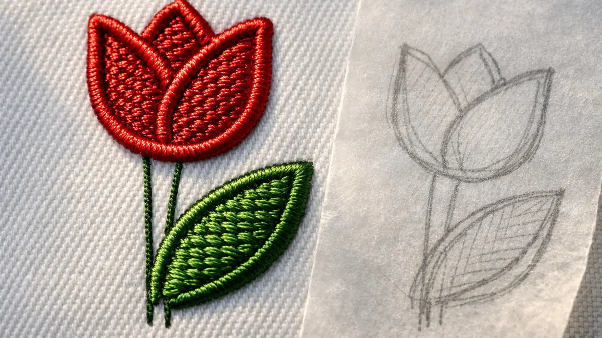
Digitizing is the step that turns a picture into a stitch file a machine can sew. It is not tracing; it is deciding how every shape should be stitched, in what order, and with how much thread. Good digitizing is mostly three decisions repeated: stitch type, underlay, and compensation for how thread pulls. This guide walks the whole workflow in that order.
What does it mean to digitize embroidery?
Digitizing means converting artwork into a sequence of stitches with instructions for your machine: stitch type, direction, density, color stops and trims. The output is a machine file such as PES, DST or JEF, not an image. Opening a JPG in embroidery software does not make it stitchable; something has to decide where each needle penetration goes, and that something is either you or an auto-digitizing tool.
This is why you cannot just send a logo to a machine. The machine reads stitch coordinates, not pixels. Our file formats guide explains what actually lives inside a finished design file.
What software do you need to digitize?
You need software that creates stitches, not one that only converts or letters. Editing-only tools cannot draw new stitch objects. The usual choices:
| Tool | Cost | Digitizing type | Platform |
|---|---|---|---|
| Ink/Stitch (in Inkscape) | Free | Manual, auto-fill of vectors | Windows, macOS, Linux |
| Embrilliance StitchArtist | $179 to $699 | Manual | Windows, macOS |
| Hatch Composer | $699 | Auto and editing | Windows |
| Hatch Digitizer | $1,199 | Auto and full manual | Windows |
| Brother PE-Design 11 | Dealer price | Auto and manual | Windows |
If you are choosing between the two most common paid platforms, see Hatch vs Embrilliance; for the full field, the software roundup covers all of them.
How do you prepare artwork for digitizing?
Start with the simplest, cleanest version of the art you can get. Bold shapes, solid colors and few fine details digitize well; photographs, gradients and tiny text do not. Redraw complex art as flat color blocks before you begin, because the machine cannot reproduce a gradient or a hairline the way a printer can.
Decide the finished size first, since stitch count and detail depend on it. A 2 inch logo cannot hold text a 4 inch version can. Simplify, flatten colors, and remove any detail smaller than roughly 1.5 mm, which is near the limit of what thread resolves cleanly.
Which stitch type do you use for each shape?
Match the stitch type to the shape’s size and job. The three core types cover almost everything, and the choice between satin and fill comes down to column width.
| Stitch type | Use it for | Rule of thumb |
|---|---|---|
| Running (walk) | Outlines, fine detail, travel, underlay | Thin single lines and stems |
| Satin (column) | Borders, lettering, narrow shapes | Columns up to about 7 to 10 mm wide |
| Fill (tatami) | Large areas | Anything wider than a satin can span cleanly |
A satin stitch stretched too wide snags and loosens, so wide shapes get a fill. A fill used on a thin line looks lumpy, so thin shapes get satin or running. Lettering under about 5 mm tall needs careful satin and often a finer thread; our thread guide covers 60 weight for small text.
Why do underlay and pull compensation matter?
They are what separate a flat, crisp design from one that puckers and gaps. Underlay is a layer of light stitches sewn first to stabilize the fabric and give the top stitches a foundation. Without it, satin and fill stitches sink into the fabric and the surface puckers.
Pull compensation adds a little width to shapes to offset the inward pull of thread tension. As a satin column stitches, tension drags the edges inward, so digitizers extend the shape slightly so it finishes at the intended width. Stretchy knit needs more compensation than stable woven. Both settings exist in every real digitizing tool; learning to set them for the fabric is most of the skill. The fabric and stabilizer pairing drives both, so read the stabilizer guide alongside this.
How do you sequence a design and set density?
Sequence objects to minimize travel, color changes and trims, and set density to the fabric. Order matters: stitch underlay before top layers, group same-color objects so the machine does not change thread more than needed, and put outlines last so they sit cleanly on top.
Density is how close the stitch rows sit. Too dense and the design stiffens, thread breaks and the back fills with thread; too open and the fabric shows through. A common satin density starts near 0.4 mm and opens up on thick fabric. Add automatic trims between jumps so you are not snipping loose threads by hand on every stitch-out.
How do you test and fix a digitized design?
Always stitch a test on the same fabric and stabilizer you will use for the real piece, then read the result and adjust. The test stitch is the feedback loop that teaches digitizing faster than any tutorial.
- Puckering: add or change underlay, firmer stabilizer, hoop more carefully.
- Gaps at satin edges: increase pull compensation.
- Thread breaks or stiff patches: reduce density.
- Outlines off register: sequence outlines last, stabilize better, slow the machine.
Change one thing at a time and restitch. For your first projects, the machine embroidery for beginners guide shows the hooping and stabilizer basics that most digitizing problems trace back to.
How do you digitize lettering and small text?
Lettering is digitized as satin columns, and the limit is letter height, not font. Most embroidery fonts stitch cleanly down to about 5 mm tall; below that, satin columns get too narrow to hold thread and the letters fill in or fray. For small text, switch to a finer 60 weight thread and a font designed for small sizes, and keep the design simple.
There are two ways to put text on a design. Keyboard lettering, in editing software, places ready-made font objects and sizes them, which is fast and needs no digitizing skill. True digitizing of custom lettering means building the satin columns yourself, which you only need for a logo typeface the software does not have. For most work, keyboard lettering with a good font set covers it; our fonts guide and the thread guide cover sizing text and the thread weight it needs.
What are the most common digitizing mistakes?
The frequent mistakes all come from skipping the three core decisions or the test stitch. Knowing them shortens the learning curve, because you can check your file against the list before you sew.
- Too much density. Packing stitches tight makes the design stiff, breaks thread and fills the back; open the density to suit the fabric.
- No underlay. Skipping underlay lets top stitches sink and the surface pucker; add it under every satin and fill.
- Wrong stitch type for the size. A satin stretched too wide snags; a fill on a thin line looks lumpy. Match type to width.
- Poor sequencing. Too many color changes and trims waste time and leave loose threads; group same colors and order outlines last.
- No test stitch. Trusting a file untested is the biggest one; always sew it on the real fabric and stabilizer first.
Most of these show up in the first stitch-out, which is why the test is not optional. Fix one variable at a time and restitch.
Who should pay a digitizing service instead?
- Anyone needing one logo once. A service digitizes a logo for a modest flat fee, far less than buying and learning Digitizer.
- Businesses on a deadline. A professional returns a clean, tested file faster than you can learn to make one.
- Complex art with small text or gradients. These are where self-taught files fail; a pro has the tools and the practice.
Learn digitizing if you will make many of your own designs and want control. Hire it out for one-offs and anything a customer is paying for.
Sources: Wilcom Hatch and Brother PE-Design documentation (stitch types, underlay, auto-digitizing); Embrilliance StitchArtist pages (manual digitizing scope); Ink/Stitch documentation (fill and satin tools, underlay, pull compensation); common digitizing practice for density and sequencing.
Frequently asked questions
Quick answers to what readers ask us most
Can you teach yourself to digitize embroidery?
Yes. Most home digitizers are self-taught using their software's tutorials plus test stitching on scrap fabric. Start with simple, bold shapes and few colors. Expect your first files to pucker or gap; the fix is reading the stitch-out and adjusting density, underlay and pull compensation.
What software do you need to digitize embroidery?
Digitizing needs software that creates stitches, not just converts files. Common options are Hatch Composer or Digitizer and Embrilliance StitchArtist for paid tools, or Ink/Stitch inside Inkscape for free. Editing-only tools like Embrilliance Essentials cannot digitize from scratch.
Is auto-digitizing good enough?
For simple, bold artwork with few colors, auto-digitizing gives a usable starting point you then clean up. For small text, thin lines, gradients or a customer logo, it usually fails, and you either digitize manually or hire a service. Always test-stitch an auto file before trusting it.
What is pull compensation in digitizing?
Pull compensation is extra width added to shapes so the thread tension that pulls stitches inward does not leave gaps at the edges. Columns pull narrower and shorter as they stitch, so digitizers extend them slightly, more on stretchy fabric, less on stable woven.
How long does it take to digitize a design?
A simple name or logo can take 15 to 30 minutes once you know the software. A detailed multi-color design can take hours. Much of the time goes into sequencing, underlay and test stitching, not drawing the shapes.